SHISEIDO GLOBAL FLAGSHIP STORE Vol.1 | Project Outline
Case Study
BRIEF
The SHISEIDO GLOBAL FLAGSHIP STORE is now open. Here at the SHISEIDO GLOBAL FLAGSHIP STORE, you will see the digital contents with the latest technology. WOW was in charge of the planning, direction and production of the flagship store’s in-store contents, symbols, and PR tools.
PROCESS
Since store fixture location and enclosure design are closely associated with UX, WOW has been working with companies on co-creation from interior design to store fixture design and backend development since 2018.
RESULT
By creating digital experiences through in-store content, positioning the brand with installations, and producing PR tools, WOW made a significant contribution to the new customer experience that the flagship store was going for.
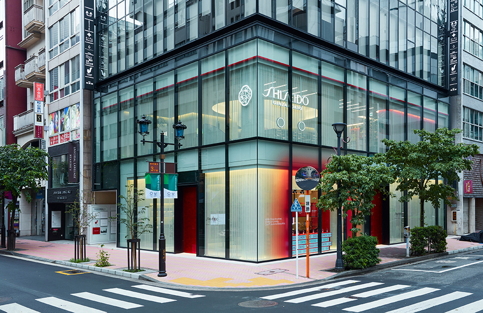
SHISEIDO, already operating in 88 countries and regions around the world, saw the grand opening of its SHISEIDO GLOBAL FLAGSHIP STORE in Ginza, where the company has been initially founded. The flagship store occupies three floors of the building, making it the largest branch that the brand operates.
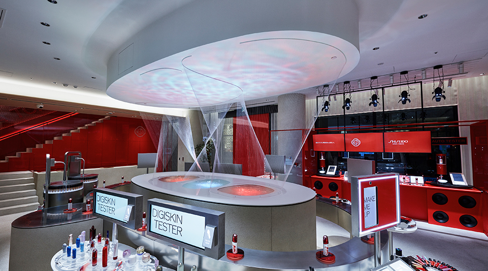
The flagship store wants to make its positioning known and provide a beauty experience that combines the latest technology with a human touch. In response to serving diversifying beauty needs and lifestyles, the store also offers digital testers that allow customers to freely and happily try cosmetics through all five senses, beauty counseling tailored to customer needs, and the first advanced meditation experience in Japan. In the wake of COVID-19, SHISEIDO is seeing more customers who wish to make their purchases without physical contact, and they are working to improve the hygiene of their stores. At the same time, they are incorporating products and services - such as their “non-contact” beauty counseling and auto-testers - that will help put their customers’ minds at ease as they experience new lifestyles.
The flagship store wants to make its positioning known and provide a beauty experience that combines the latest technology with a human touch. In response to serving diversifying beauty needs and lifestyles, the store also offers digital testers that allow customers to freely and happily try cosmetics through all five senses, beauty counseling tailored to customer needs, and the first advanced meditation experience in Japan. In the wake of COVID-19, SHISEIDO is seeing more customers who wish to make their purchases without physical contact, and they are working to improve the hygiene of their stores. At the same time, they are incorporating products and services - such as their “non-contact” beauty counseling and auto-testers - that will help put their customers’ minds at ease as they experience new lifestyles.
Project Outline
At this flagship store, which seeks to raise awareness and understanding of the SHISEIDO brand through experiences that stimulate the quest for beauty, WOW was involved in the following:
UI/UX Design for Products and Services on 1F and 2F
WOW was entirely in charge of the UI/UX design of the technology-intensive store fixtures on the first and second floors at the flagship store. Since store fixture location and enclosure design are closely associated with UX, in order to achieve the best UI/ UX, WOW has worked with companies on co-creation from interior design to store fixture design and backend development.
Planning, Directing, and Producing Installation Works That Embody the Brand
For the installation of the water basin, which is now the symbol of SHISEIDO’s flagship store, WOW was in charge of everything from conceptualizing the symbol to design, program development, and implementation, based on and linked to the store concept that SHISEIDO had conceived.
Planning, Direction, and Production of PR Tools (Video and Graphics)
WOW planned, directed, and produced introductory videos, graphic tools, and various other flagship store contents.
Here at the SHISEIDO GLOBAL FLAGSHIP STORE, with all its partnering businesses gathering, you will see digital contents that you won’t be able to find anywhere else. WOW spent time and had a discussion with SHISEIDO and its partnering businesses, allowing our collaboration to proceed smoothly. WOW applied SHISEIDO’s positioning ideas to the store’s UI/UX design, installation, and PR tools to create an integrated design and user experience.
Table of Contents
UI Design Concepts
・ Stress-Free UX
・ Space Affinity
S Connect, in Support of Contents Experience and Shopping
1F – Play with Beauty
・ Visual Effects During Standby Screen
・ The Beauty Intelligent Partner “LEAH”
2F – Create Your Own Beauty
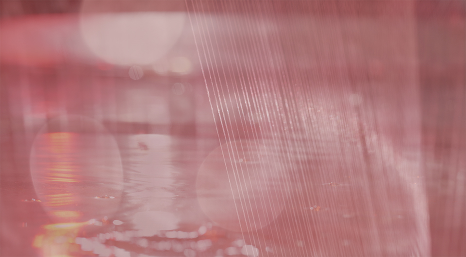
Water Feature Installation “SOURCE OF ALIVE”
・ Stress-Free UX
・ Space Affinity
S Connect, in Support of Contents Experience and Shopping
1F – Play with Beauty
・ Visual Effects During Standby Screen
・ The Beauty Intelligent Partner “LEAH”
2F – Create Your Own Beauty
Water Feature Installation “SOURCE OF ALIVE”
UI Design Concepts
Space Affinity
[Condition specified]
That SHISEIDO’s brand colors (red, white and black) are used uniformly throughout the building.
[Basic ideas]
- That the graphic user interface also be aligned with the brand colors to match the interior of the building.
- That the base color of the graphic user interface be white to create a clean and bright impression.
- That red is used as an accent color for highlighting and buttons that encourage users to take action.
- That water ripples be applied to the graphics in order to match the natural and organic feel of the store interior and the water feature installation.
[Results]
Inserted CG animation of ripples goes beneath the product photo to create a three-dimensional effect.
- Added animation with “light” and “nature” to show the essence of SHISEIDO.
- Focused on “simple design” without flashy visual elements to make the product shine.
- The content has an elegant design. In addition, the margins allow customers to read information without stress.
Stress-Free UX
[Basic ideas]
- That, to avoid user disengagement from the contents, the cost of learning the machine’s operation be set low to produce a casual experience.
- That familiar layout be used for easy operability.
- That information be delivered in steps according to the user’s actions.
- That animation navigates window transitions and methods of presentation so that the user doesn’t become overloaded with information.
[Results]
- The animation seamlessly connects each window to display the layers of information in a continuous flow.
- Animation was used to direct the user’s attention and encourage them to use the machine.
- Animation played a major role in avoiding the breakdown of information connections.
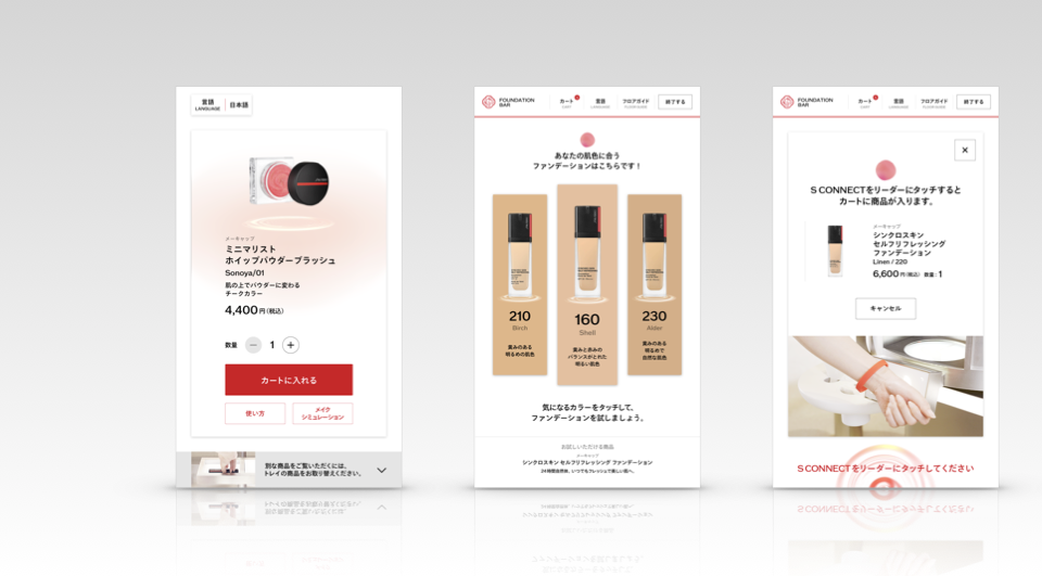
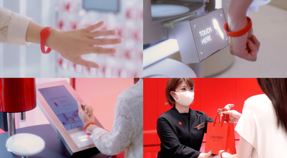
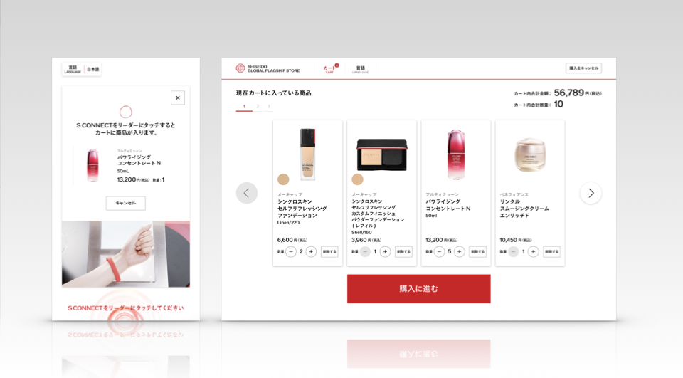
S CONNECT | Supporting Your Contents Experience and Shopping
S CONNECT is a wristband that records the results of the contents you have experienced and the products you would like to purchase. The wristband is linked to all the products and contents in the store, and if you follow the signs and hold the wristband over the signs, the wristband will record the products you want in your shopping cart. When you are ready to check out, simply hold the wristband over one of the tablets at the checkout counter, and you will be able to go home with everything you want.
Overseas, Amazon Go provides a similar service. At the time of its development, however, S CONNECT was not yet widely used in Japan, so the challenge we faced was to help people what it is for and how to use it.
WOW was behind the creation of the UI for S CONNECT with features that facilitate user understanding. In addition to helping the user experience products, the wristband was also designed to record the user's favorite products in their cart and to help them proceed smoothly at the checkout counter. This feature has been embedded in all experiential content that can be purchased.
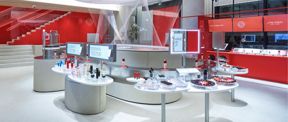
1F | Play with Beauty
Customers can try all the experience contents on the first floor to explore what they like and choose what they want. WOW was in charge of the UI design for the five experiential contents set up on the first floor. This floor runs on self-service with no Beauty Consultants. As such, we were faced with the challenges of helping customers gain content experience and conveying product information. We wanted the floor to be a place where people run into items that they were not previously aware of.
Standby Screen to Facilitate Understanding of Operation
When encouraging users to experience a new device, one of the most important points to keep in mind is that we need to help them want to try using the device without their being resistant. A video explaining the operation will be shown on the standby screen to take the user through the process. This technique was commonly incorporated into the design of all experiential contents.
The Beauty Intelligent Partner “LEAH”
“LEAH,” a character from SHISEIDO, will act as a guide to users on behalf of Beauty Consultants to assist with operations of the machine. In order for LEAH to act as a guide for the store’s customers and for it to work closely with the UI in terms of information organization, WOW defined the role of LEAH within the experience content. With LEAH, the customer can find exactly the information he or she needs no matter which content they operate. We consulted with LEAH’s designers to keep LEAH the way it is and also to ensure that it would function properly even with all the information uploaded to it.
Please refer to Vol.2 for details about the five contents.
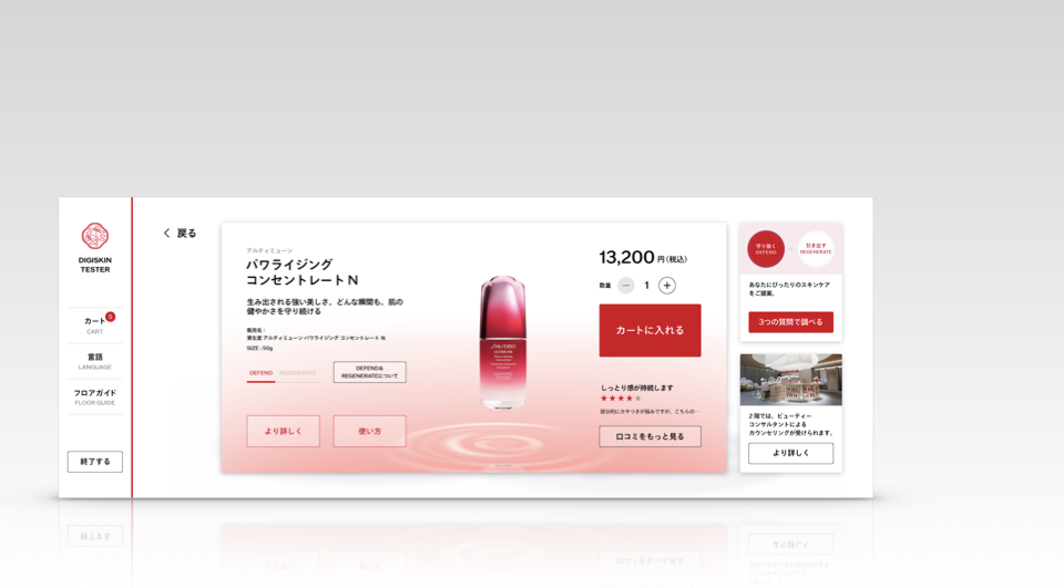
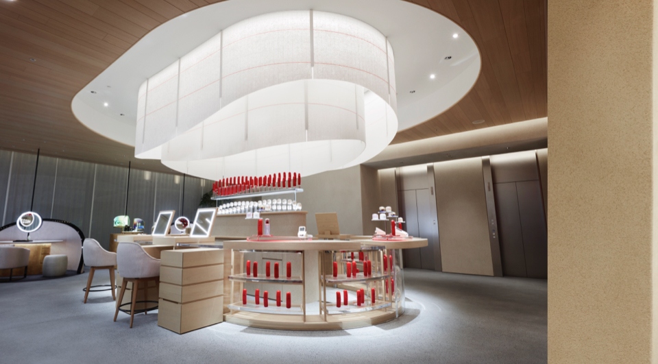
2F | Create Your Own Beauty
On this floor, customers can receive counseling and customized services from SHISEIDO’s Beauty Consultants. - where you can discover your own unique beauty with the help of SHISEIDO’s professionals based on the results of your experience and lifestyle diagnosis on the first floor. WOW was in charge of designing the UI for the counseling tablets and the UI design for the imprinting service. This is where you discover beauty like you never have through conversations with SHISEIDO’s Beauty Consultants.
Please refer to Vol.2 for details about this floor.
Please refer to Vol.2 for details about this floor.
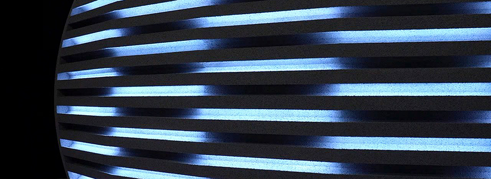
Water Feature Installation “SOURCE OF ALIVE” | Source of “Beauty is Alive”
Water is the source of makeup, and as it pours down from the ceiling onto the water feature, ripples of “light” emerge fluidly with it, circulating and changing as if water and light were always breathing. The water droplets are computer-controlled, mimicking heartbeats. SHISEIDO’s skincare technology helps with nerve transmission and immunity activation within the skin. The ripples on the ceiling are supposed to resemble both of these.
Staff List
1F / 2F Contents
Producer: Go Hagiwara
UI/UX Designer:Sayaka Maruyama, Saki Kato, Takaaki Morita, Yutaka Kadota, Mayu Kobayashi, Reiko Katayama
Movie:Shigeru Makino, Misaki Horai
Programming:D1、TASKO、office FA
Body Design:DC International
Body Design /Programming:V-SYNC
Interior Design:NOMURA Co., Ltd.
SE:Yusuke Tamaki
Store System Design / Implementation:NRI
Installation
Concept / Design / Program: Yuki Tazaki, Takuma Nakazi, Shunsaku Ishinabe, Daisuke Moriwaki
Lighting Design / Production:Tokyo Lighting Design
Water Landscape Design:Bellrx
Art Department: Gendai Koubou
Interior Design:NOMURA Co., Ltd.
Promotion Contents
Producer: Go Hagiwara
Director: Shigetaka Makabe
Motion Graphic Designer: Kazunori Kojima
Photographer: Toshimi Narikami
Gaffer: Yuichi Kato
DIT:Hiroyuki Watanabe
Casting: Kettle inc.
Stylist: Yoppy
Hair&Make-up: Rie Aoki
Retoucher: Kazuya Tomabechi
Editor: Sony PCL
Music:daji studio
Copy Writer: Atsushi Katayama